Ever walked into a room and felt instantly uplifted or oddly uneasy? That’s the power of color in interior design at work, subtly shaping your mood and energy. Choosing the right hues isn’t just about aesthetics—it’s about crafting spaces that reflect your story and spark the right emotions.
From calming blues to vibrant terracottas, colors can transform how your home feels and functions. This guide dives into color psychology, 2025 trends, and practical tips to help you create spaces that are uniquely yours, blending science and style effortlessly.
The Psychology of Color in Interior Design
Ever wonder why a room can make you feel “chill” or totally energized? The psychology of colors in interior design plays a huge role in shaping our emotions and setting the vibe of a space. By picking the right hues, you can turn your home into a place that reflects your personality and boosts your mood.
How Colors Affect Mood: Warm vs. Cool Tones
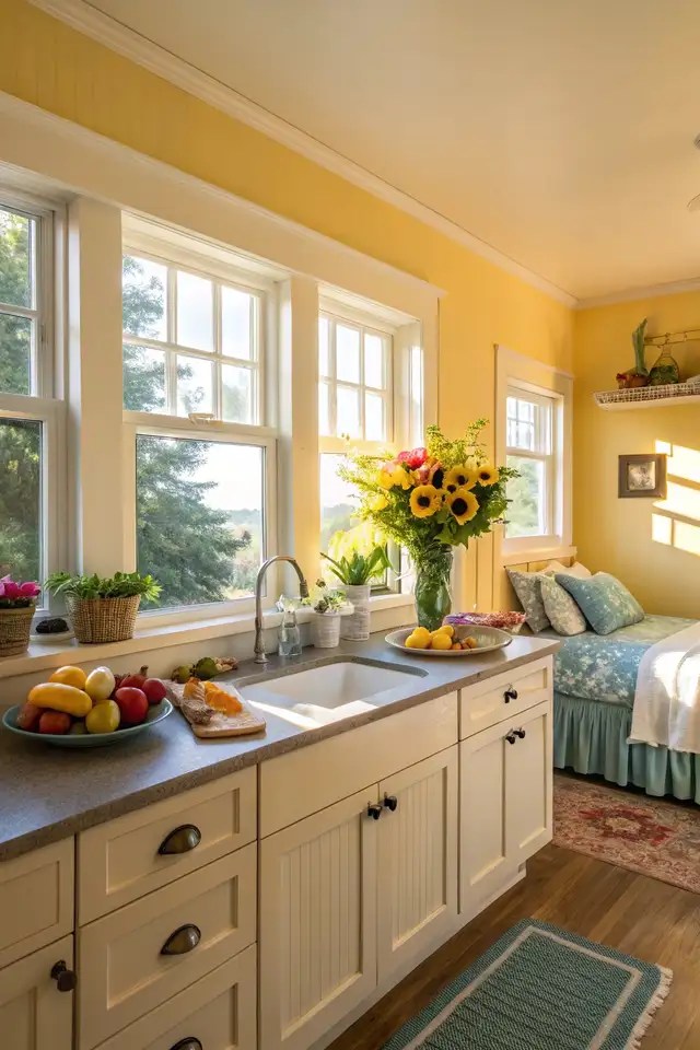
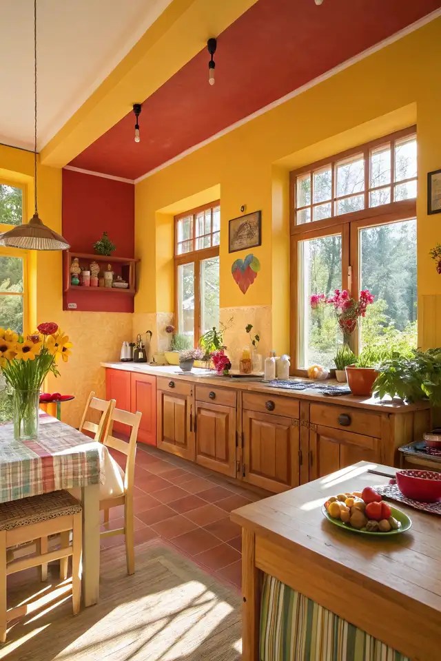
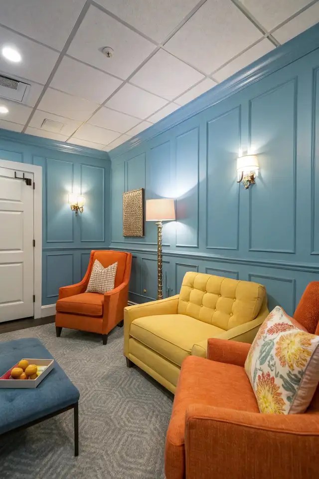
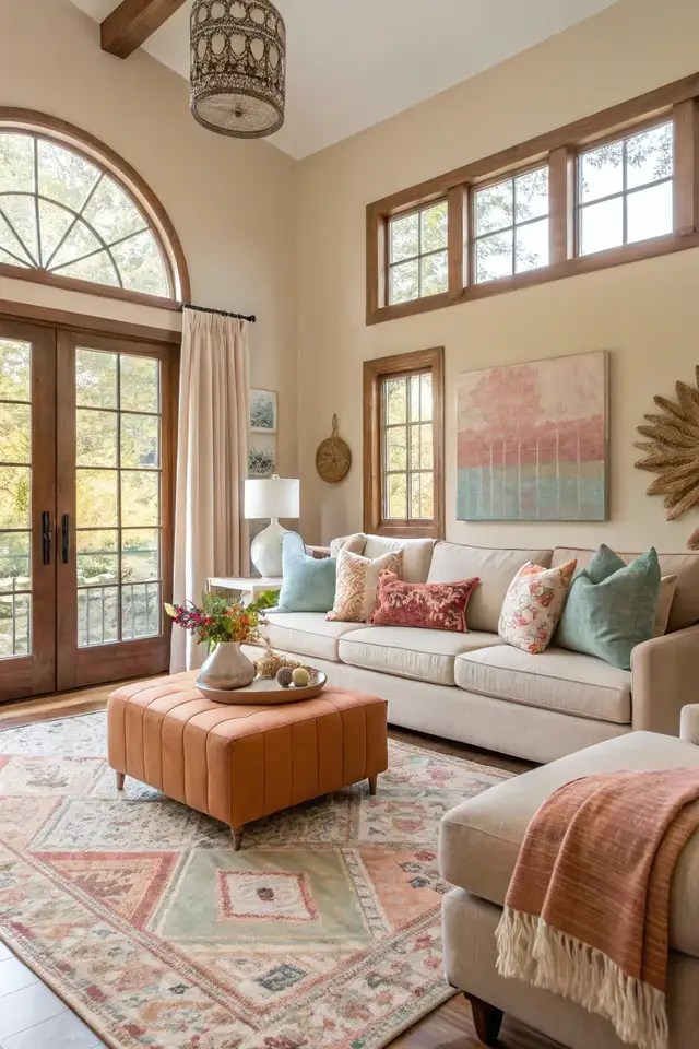
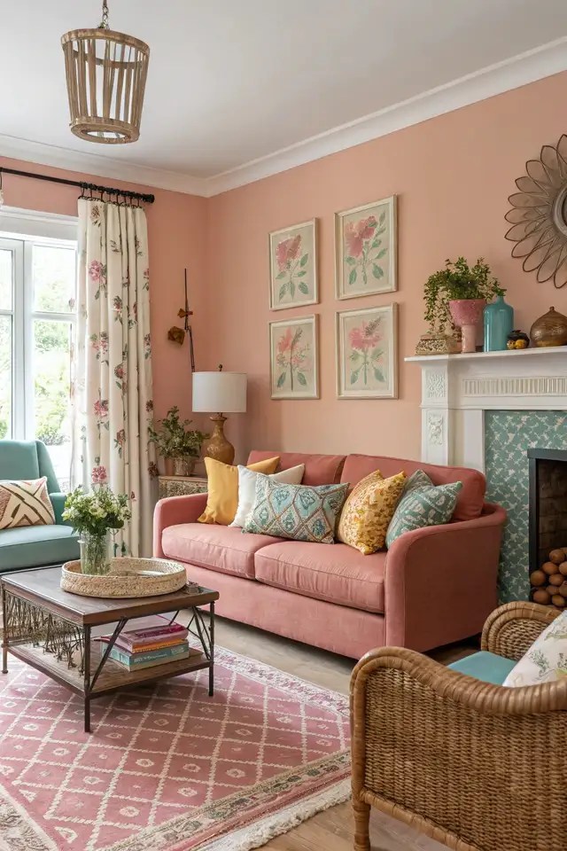
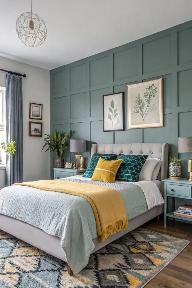
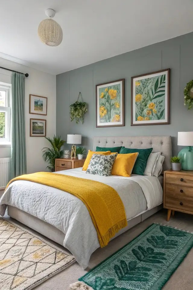
Warm tones like red, orange, and yellow spark energy and excitement. Think of a sunny kitchen with yellow walls that feels inviting and lively. Cool tones like blue, green, and purple, on the other hand, bring calmness and relaxation, perfect for a cozy bedroom.
Emotional Responses to Key Colors
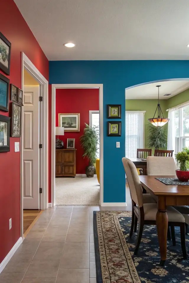

Each color triggers unique feelings. Red pumps up energy and passion, making it great for social spaces like dining rooms. Blue promotes peace and focus, ideal for home offices or bathrooms where you want to unwind.
The impact of colors on mood can transform a home, as hues like blue calm the mind while reds ignite energy and connection.
Green, tied to nature, creates balance and renewal, fitting for living rooms. Yellow brings joy and optimism but can feel overwhelming if overused. Neutral tones like beige or gray offer flexibility, letting accessories pop.
2025 Color Trends for Modern Homes
Ready to give your home a fresh, modern vibe? The interior color trends 2025 bring bold yet grounding hues that can totally transform your space. From vibrant jewel tones to earthy neutrals, these colors are all about creating a mood that feels personal and “on point”.
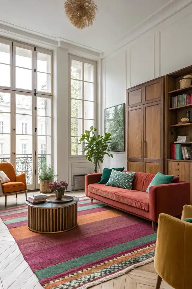
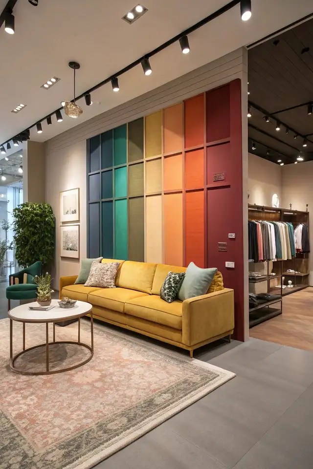
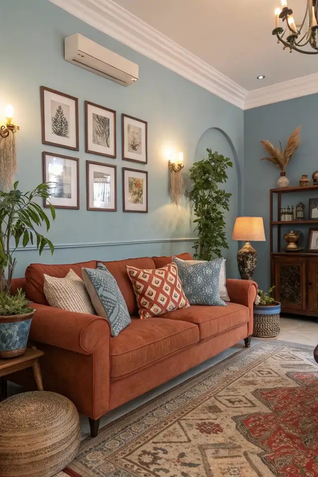
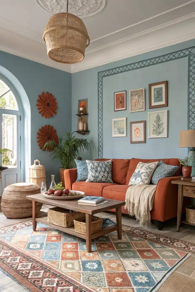
Jewel Tones and Terracottas: Vibrant Yet Grounding
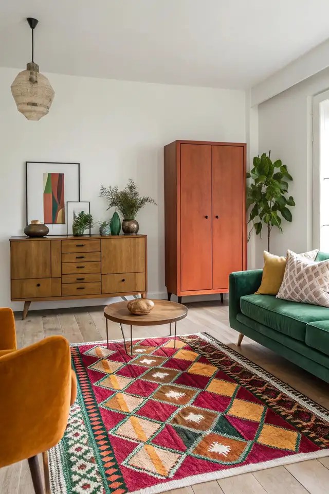
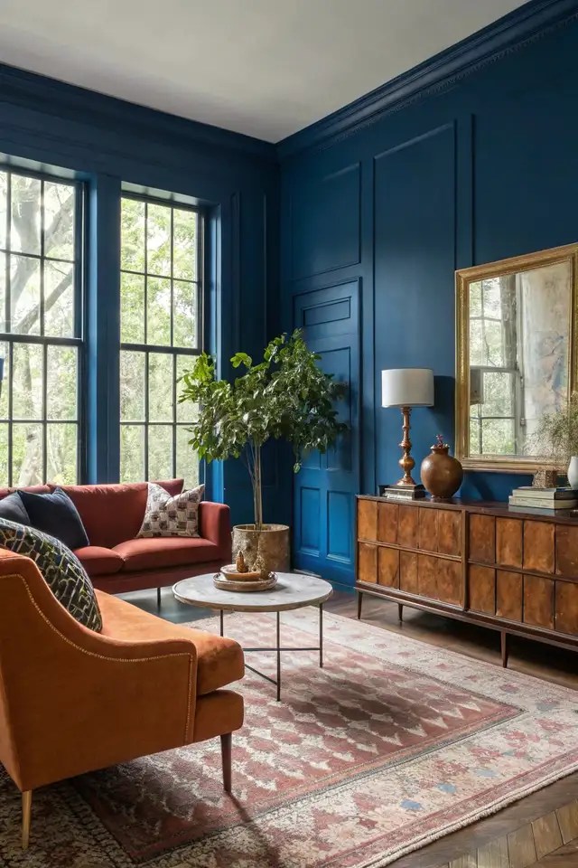
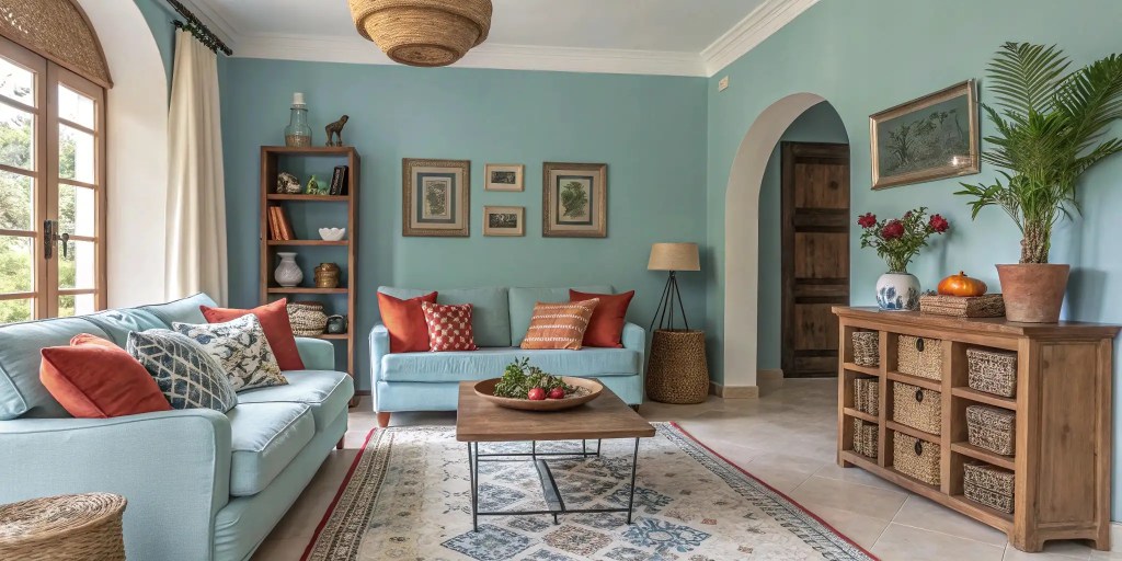
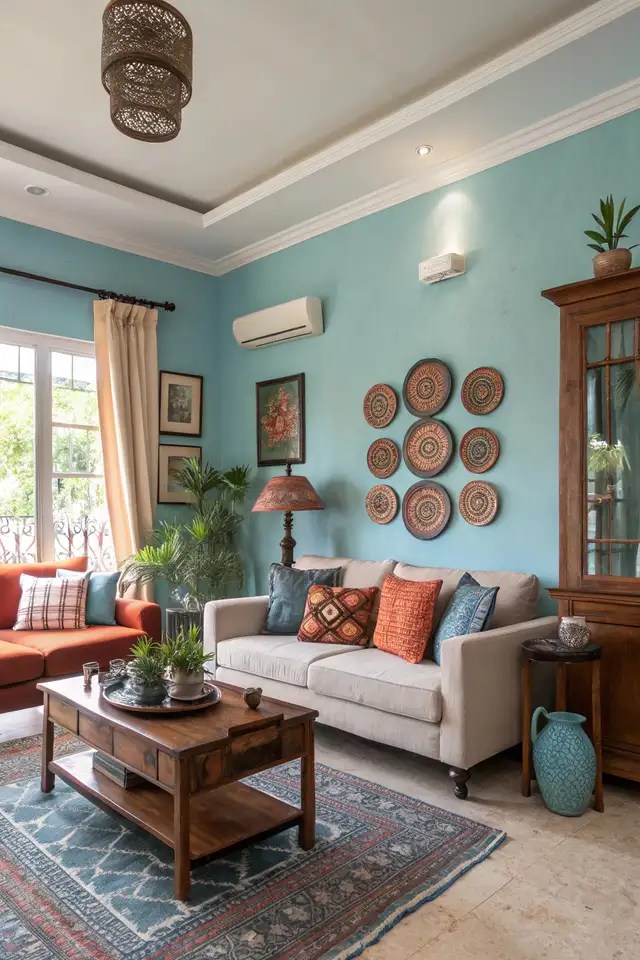
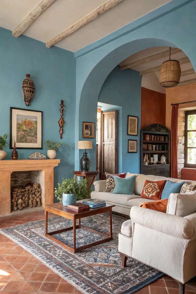
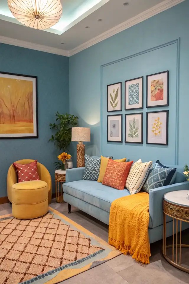
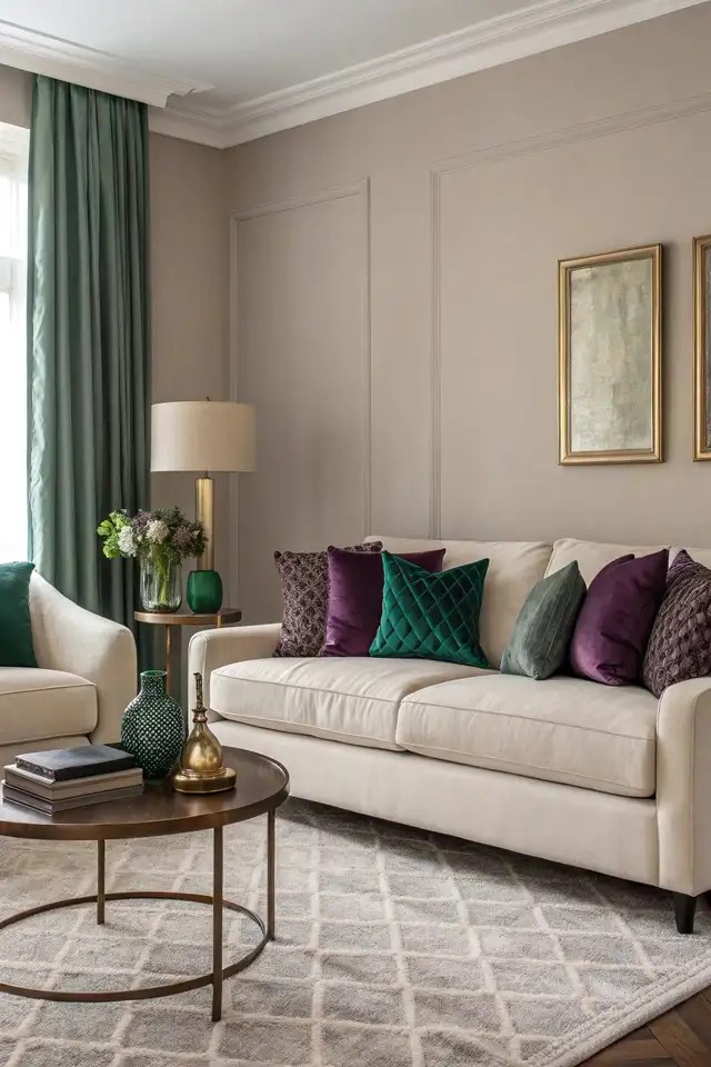
Jewel tones like emerald green, sapphire blue, and amethyst purple are stealing the show in 2025. These rich colors add drama but feel cozy when paired with warm terracottas. Think of a living room with a deep blue accent wall and terracotta throw pillows for a bold yet inviting look.
Neutral Palettes for Versatility and Timelessness

Neutrals never go out of style, and in 2025, they’re getting a modern twist. Soft taupes, creamy beiges, and muted grays create a timeless backdrop that lets your furniture shine. These hues are perfect for anyone wanting a flexible, long-lasting design.
The 2025 trends in interior design color schemes blend vibrant jewel tones with grounding neutrals to create spaces that feel both bold and balanced.
Incorporating Trending Colors in Home Decor

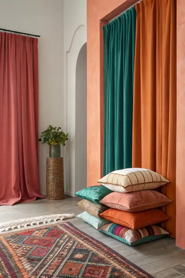
Want to nail the color in interior design for 2025? Start small with accents like curtains or rugs in jewel tones to add pops of energy. For a bigger impact, paint a feature wall in terracotta or layer neutral bedding with vibrant cushions to tie the room together.
The 2025 color trends offer endless ways to refresh your home. By mixing vibrant hues with grounding tones, you can create spaces that feel both stylish and personal. Whether you’re adding a bold accent or keeping it neutral, these colors help you design a home that’s uniquely yours.
Applying Color Theory for Balanced Designs
Ever walked into a room and felt it just “vibes” right? That’s the magic of color theory for home design, helping you mix hues to create spaces that look great and tell your story. Let’s dive into how to choose colors for your home interior using simple, practical tips.
Understanding the Color Wheel: Complementary and Analogous Hues
The color wheel is your roadmap to great design. Complementary hues, like blue and orange, sit opposite each other and create bold, lively contrasts. Analogous hues, like blue, green, and teal, sit side by side, offering a smooth, cohesive flow perfect for calm spaces.
Creating Cohesive Color Palettes for Storytelling
A good palette ties a room together and reflects your personality. Start with a base color—like a soft gray—then add pops of color, like mustard yellow or forest green, to tell a story. Using color theory for home design helps blend hues to craft spaces that feel harmonious and tell a personal story.
Think about a bedroom with cool blues and greens for tranquility or a dining room with warm reds and golds for lively gatherings. Your palette should feel like an extension of your life.
Balancing Bold and Neutral Tones for Harmony
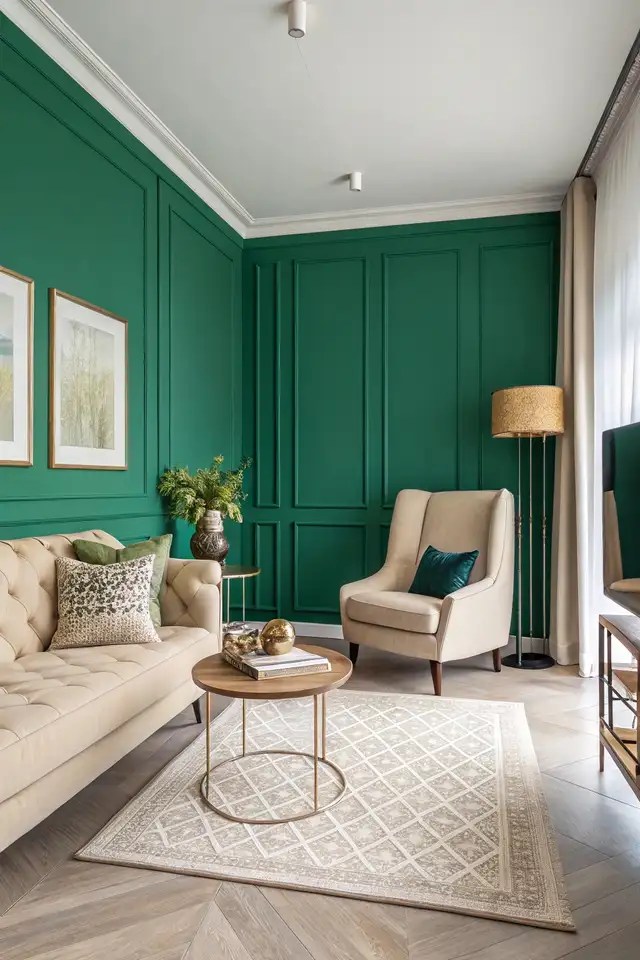
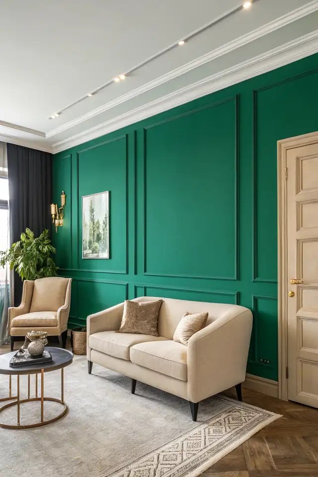
Balancing bold and neutral tones keeps a room from feeling overwhelming. Pair a vibrant emerald accent wall with creamy beiges to ground the space. This mix lets bold colors shine while neutrals add calm, creating harmony in any room.
Testing Color Combinations with Swatches
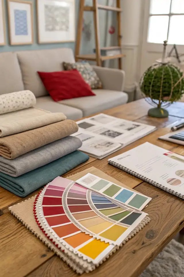
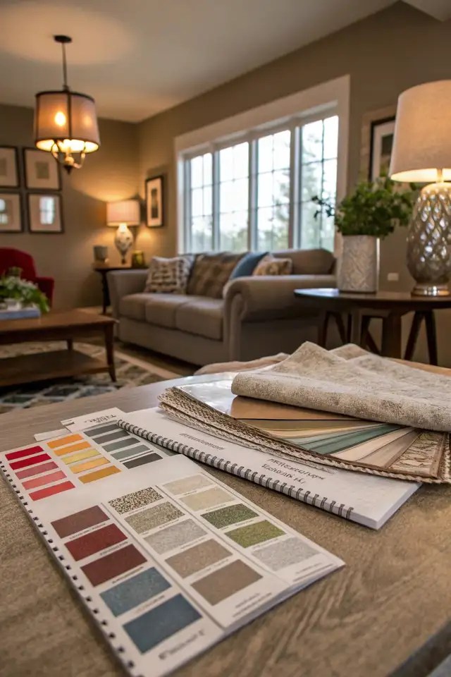
Before committing, test your colors with swatches. Lay out fabric samples or paint swatches in your space to see how they look under natural and artificial light. This step ensures your color in interior design choices feel just right for your vibe.
Applying color theory lets you craft spaces that are both beautiful and meaningful. By understanding the color wheel, building cohesive palettes, and balancing tones, you can design rooms that feel uniquely yours. Grab some swatches, play with hues, and watch your home come to life.
Picking the right colors for your home isn’t just about what looks good—it’s about creating spaces that feel like “home sweet home”. I’ve seen how a splash of terracotta or a calming blue can transform a room, reflecting your vibe and boosting your mood.
By blending color psychology, 2025 trends, and practical tips, you can craft a space that tells your story. So, grab some swatches, experiment with hues, and design a home that’s uniquely yours.
